Principles of Design
Unity
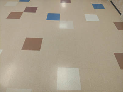
For unity, I chose the tiles in the hallway because they connect together to complete the design and give the hallway a form. They may not be the same color or in the same place but they connect together.
Rhythm
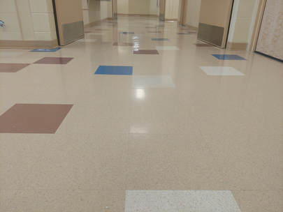
To show rhythm, I took a picture of the hallway because the tiles on the ground to connect together and form a rhythm. They aren't the same colors in the exact same place so it's a little different than a pattern.
Pattern
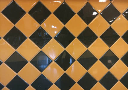
I chose the wall next to the sandwhich place in the commons because the yellow and green are continuous and the same throughout the entire wall.
Movement
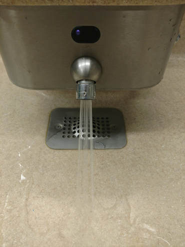
To represent movement, I used the sink in the bathroom. I turned the water on and took the picture. It makes it look like the water is actually moving and looks like the sink is alive and moving.
Emphasis
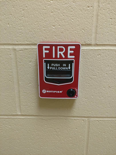
For emphasis, I took a picture of the red fire alarm on the wall. The red of the fire alarm stands out against the plain wall and gives emphasis on the importance of it. The word fire and the black handle also stands out against the red.
Contrast
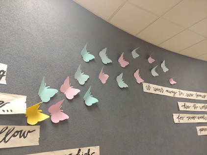
I took a picture of the butterflies on the wall to show contrast. All of the butterflies stand out against the dark grayish wall but the yellow butterfly stands out the most. It's an opposite color of the wall and so it draws your eyes to it more.
Balance
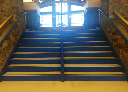
To show balance, I took a picture of the stairs in the common. They are symmetrical on each side, so they balance each other out. Even the windows in the background balance each other out.
